Elemy design system
- Company
- Elemy
- Domain
- Healthcare
- Discipline
- UI
Context
Pre-conditions
Two years after numerous iterations the product design was finally stabilized. That means that the design team finally got a chance to focus on the quality and consistency of the design and fix internal design processes.
There are many things in a features pipeline for the next year and we need to be prepared by having a solid UI library.
The design team set up
- 2 product designers (20-40% of allocation)
- 1 brand designer (10% of allocation)
- 2 software engineers as consultants
Toolkit
Figma + 5 plugins
Design
00 Audit
To understand current issues, we conducted a comprehensive audit of the current state of design in Figma and implementation.
Audit steps:
- Place all variations of common components on one page to identify inconsistencies across different files. Add screenshots of components from the implemented version.
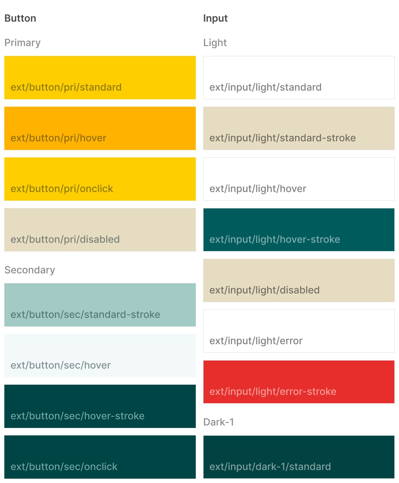
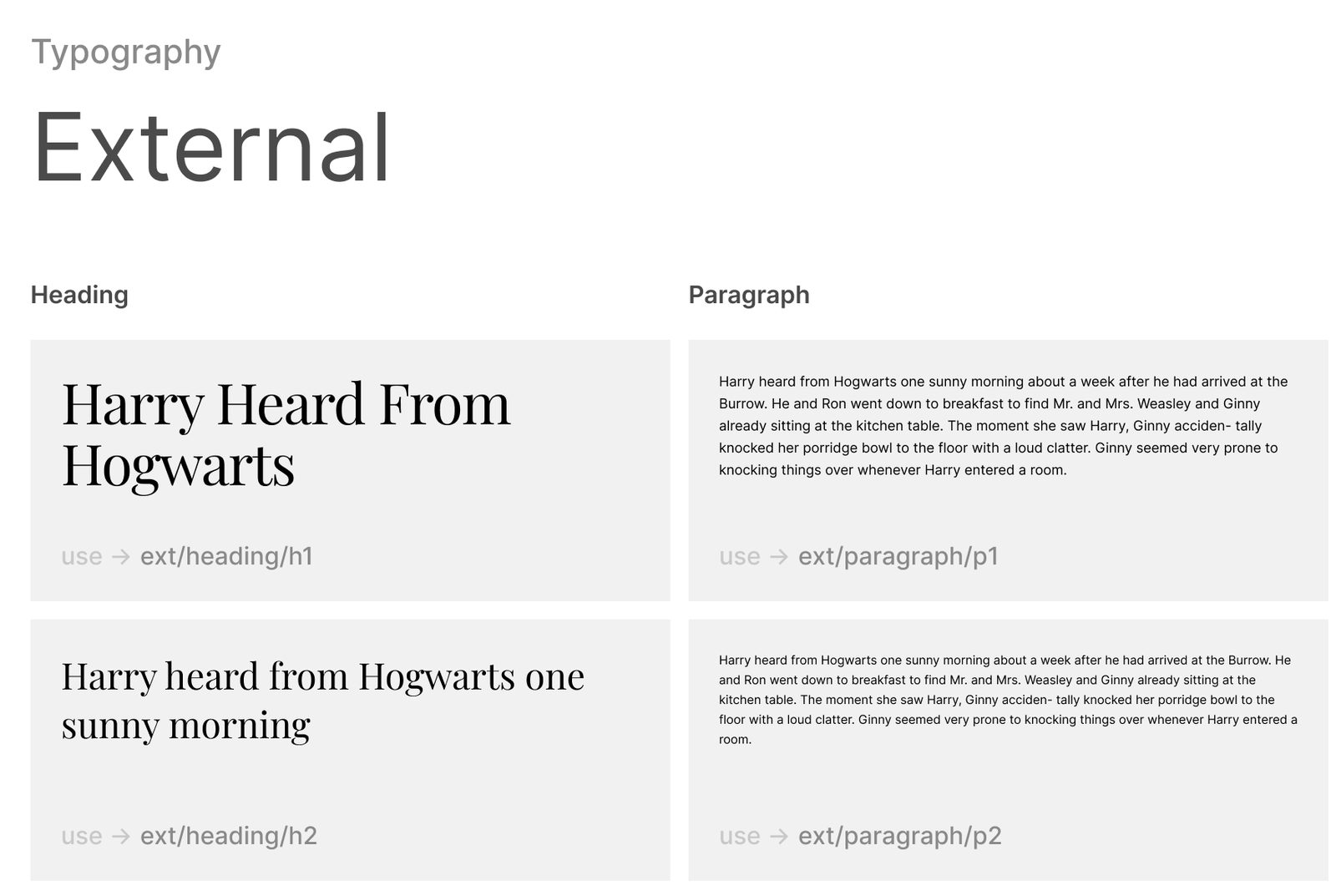
- The same thing was done for the styles: Typography, Iconography, and Colours. We used several plugins to have a full picture of the most used styles.
- Interview with the product, brand, and development team to find out current pains and let them share their vision on the UI library (or the design system in the future).
- Define the most ‘correct’ and suitable variation of components. The same for styles. Then iterative variations reduction and overall simplification. Going from ‘atoms’ to ‘organisms’.
We were able to identify that:
- There were spotted inconsistencies not only in the Figma files (library and feature) but also discrepancies with the React Storybook and implementation;
- There is no single source of truth in the design
- The current UI library is outdated and only a few from the development team know about its existence
- Connections between the library and working files were rarely established
01 Scope
Since that we have limited resources and ongoing features in the design, we have to define the exact scope of the work and definition of done.
We clearly understood that we are not able to deliver all components present in the current UI. Keeping in mind this fact we made a decision to go with documenting essential for version 1 and postpone deprioritized components.
02 Approach
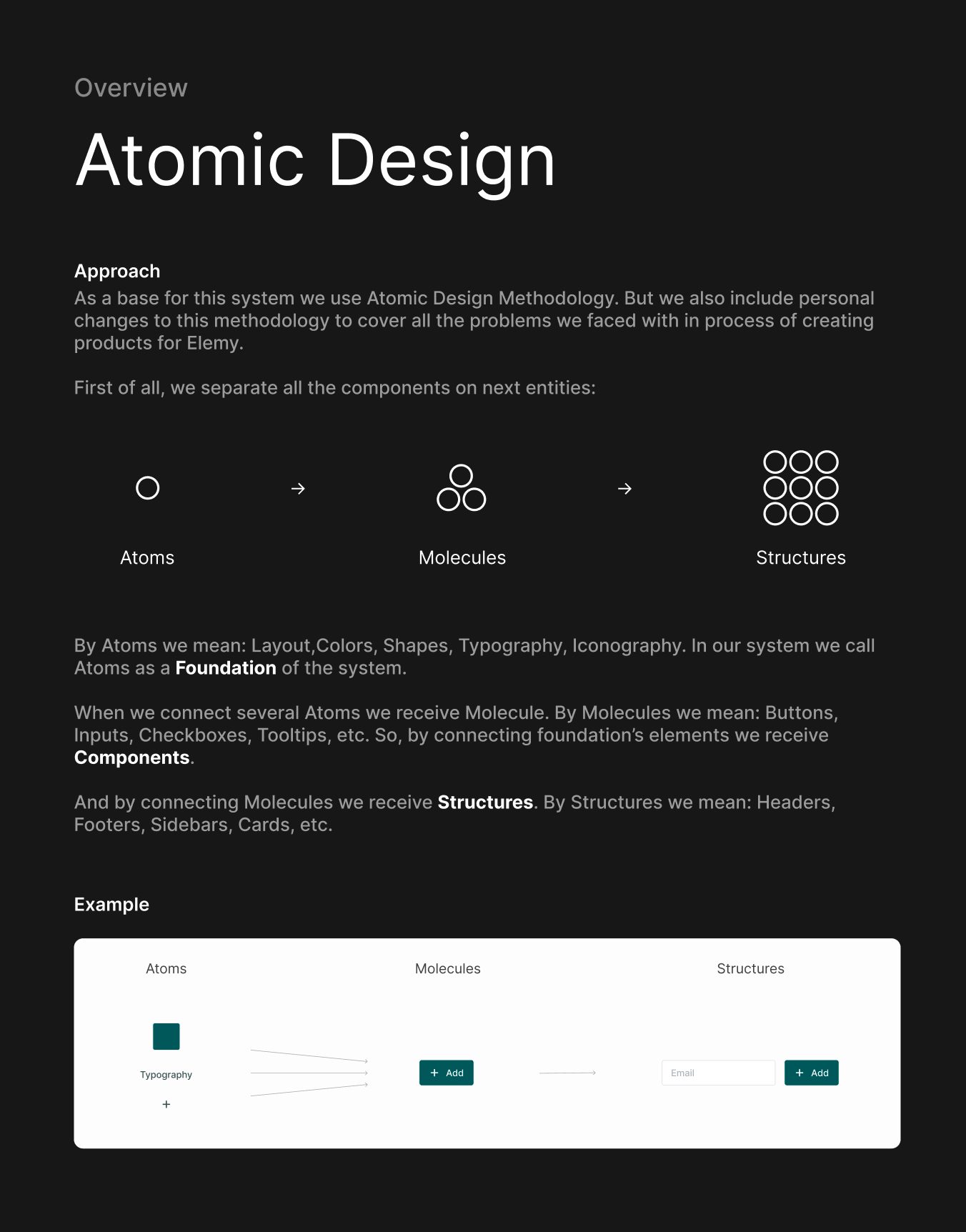
We followed the classical Atomic Design framework with slight adjustments, to fit our needs.
03 Structure
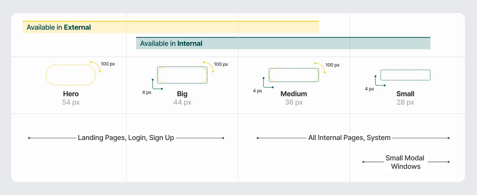
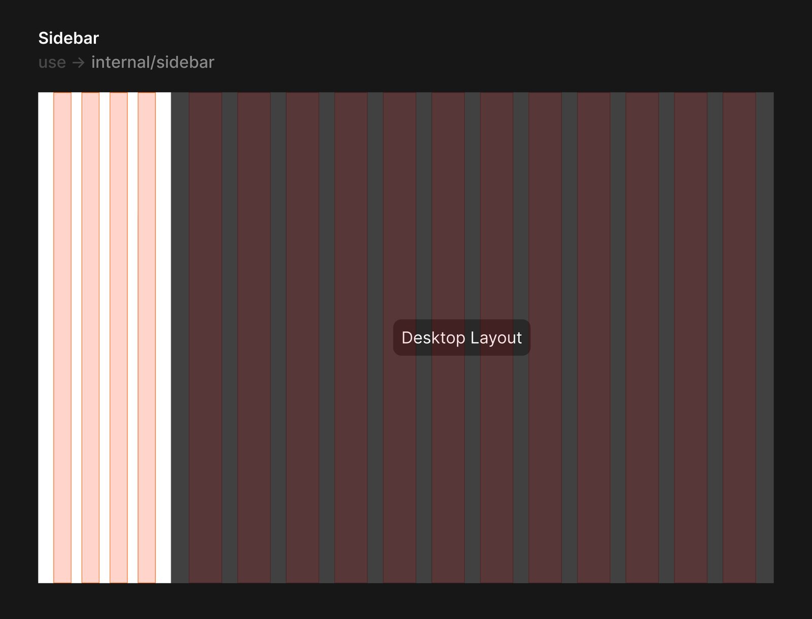
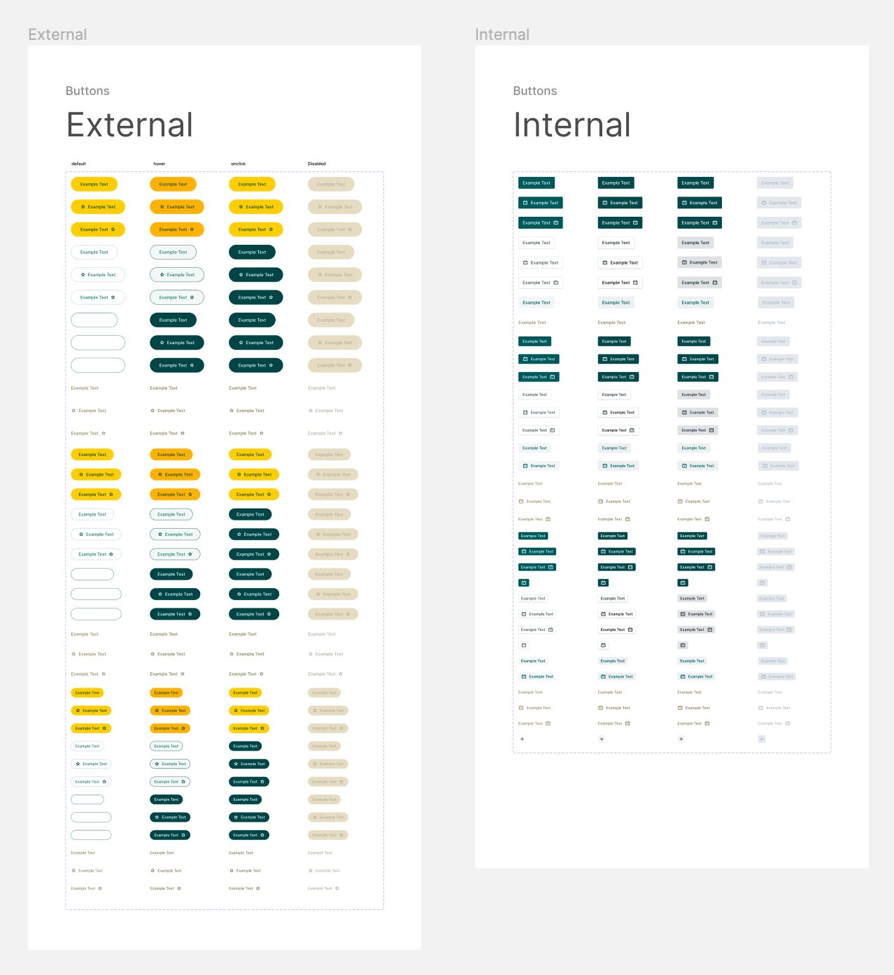
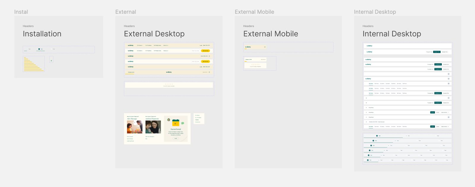
The challenge of this project was to unify two different sides of the product: internal and external UI.
- Internal - front and back office of the company operations (provider portal, admin portal).
- External - patient service side (public website, patient portal).
The two sides have different visual identity and set of components.
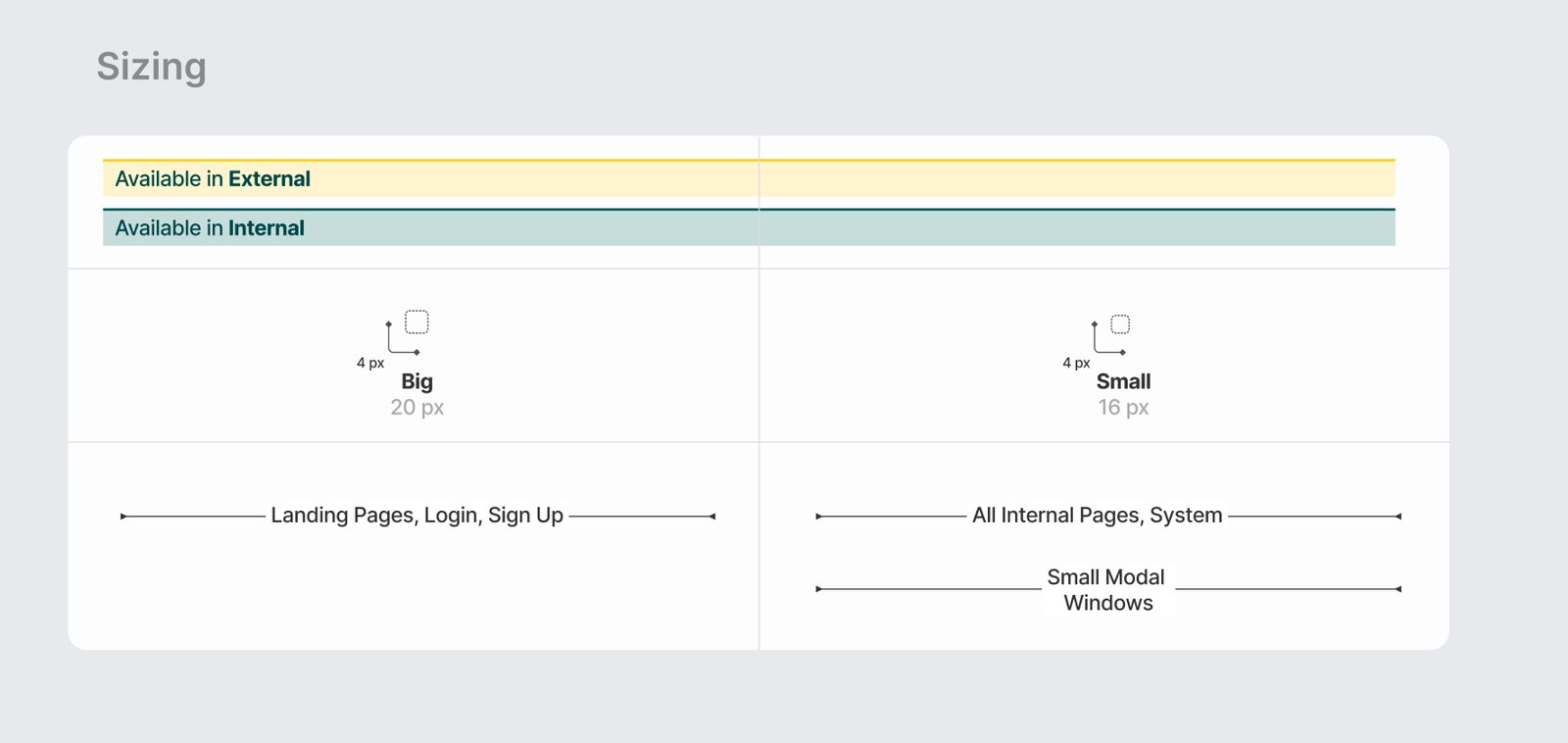
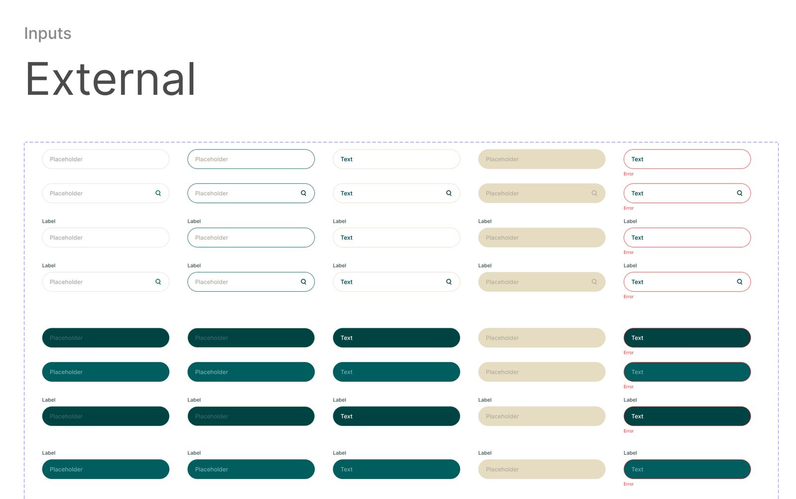
We resolved this by creating universal base components which will work for both External and Internal parts and applying respective styles to them. There was provided the specification for which products and components will be used.
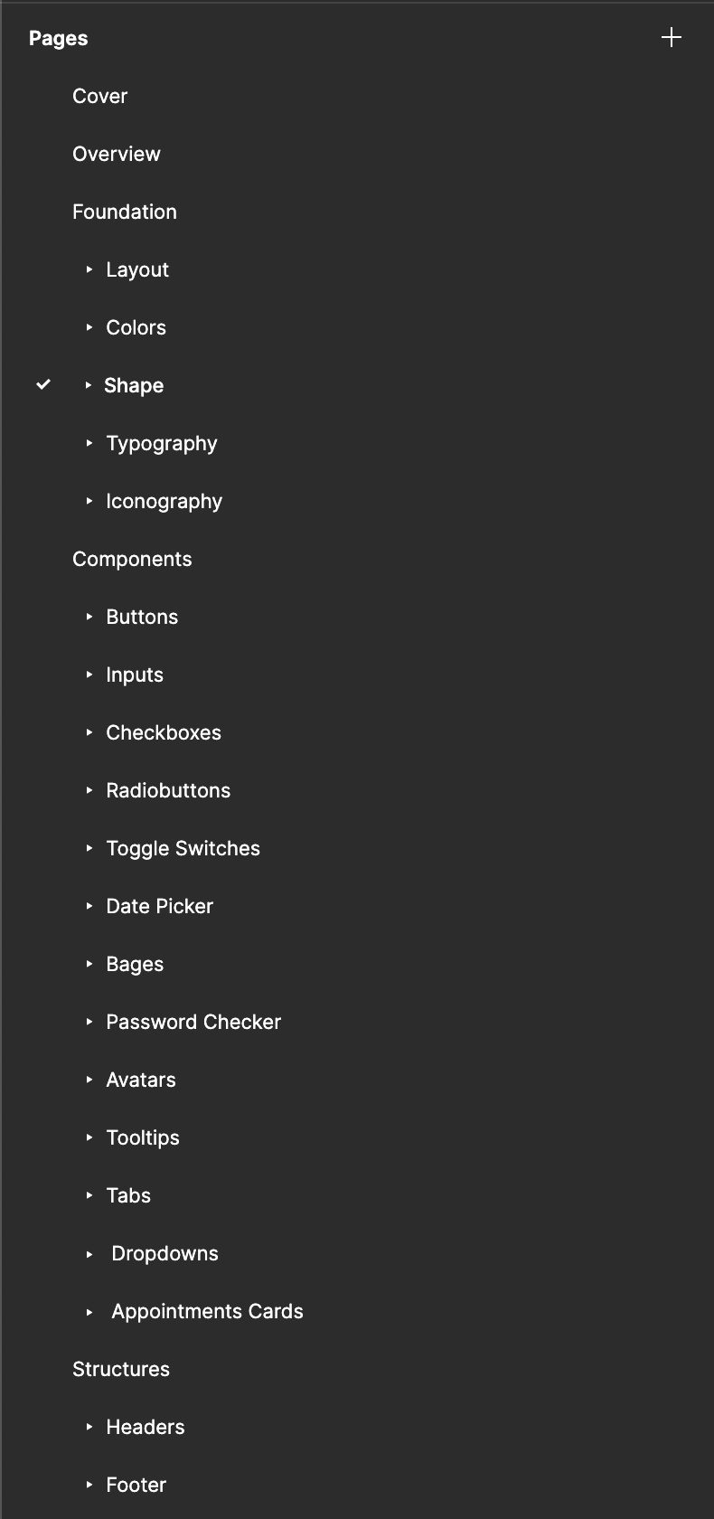
In the scope planning session with the design team, we identified a reasonable list of components that need to be done.
04 Naming convention
Before the start, we defined the naming convention of pages, layers, and components. This is crucial to have clear components organization in Figma.
05 Components properties
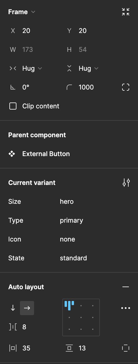
For each component have been set clear Auto-layout properties and Variants.
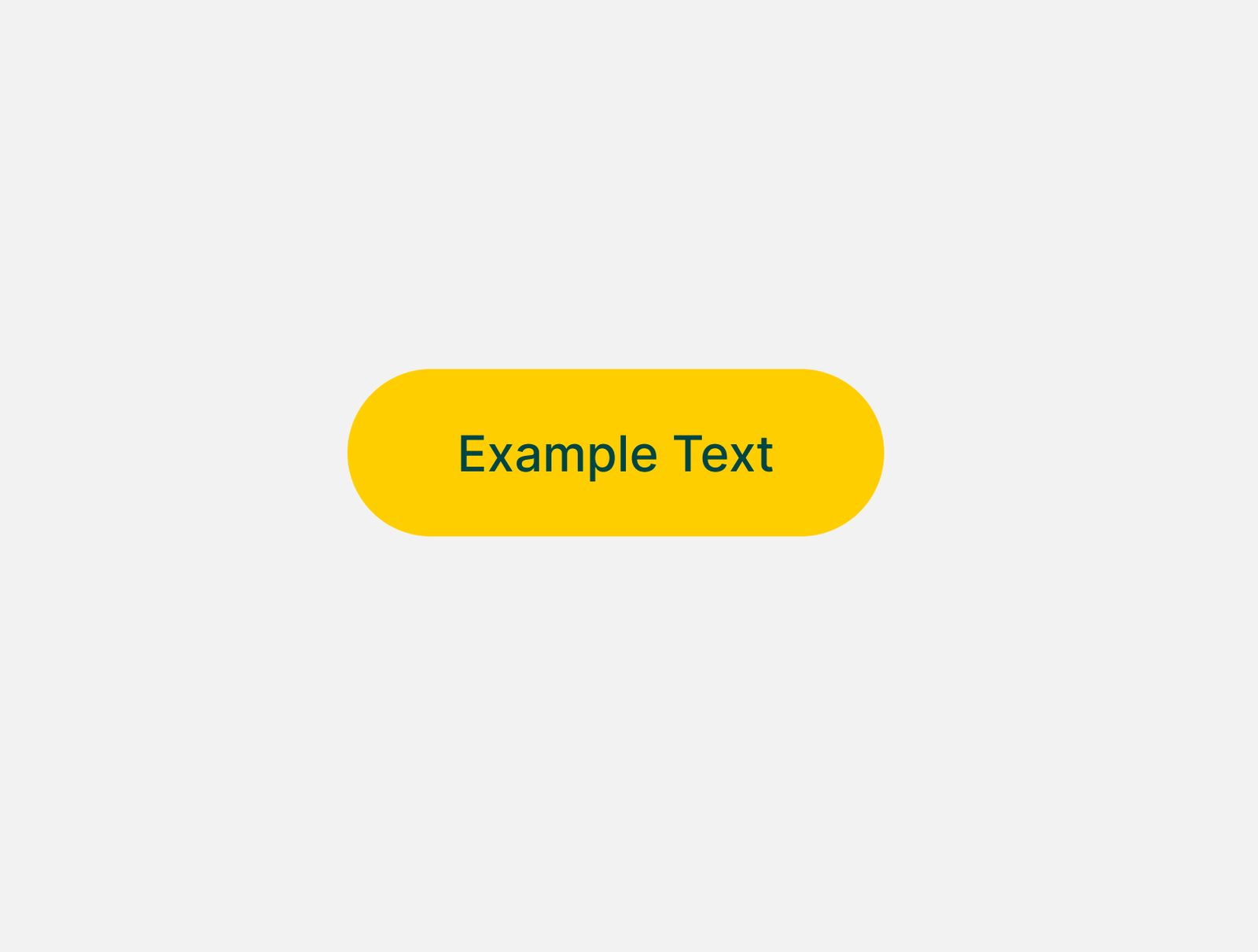
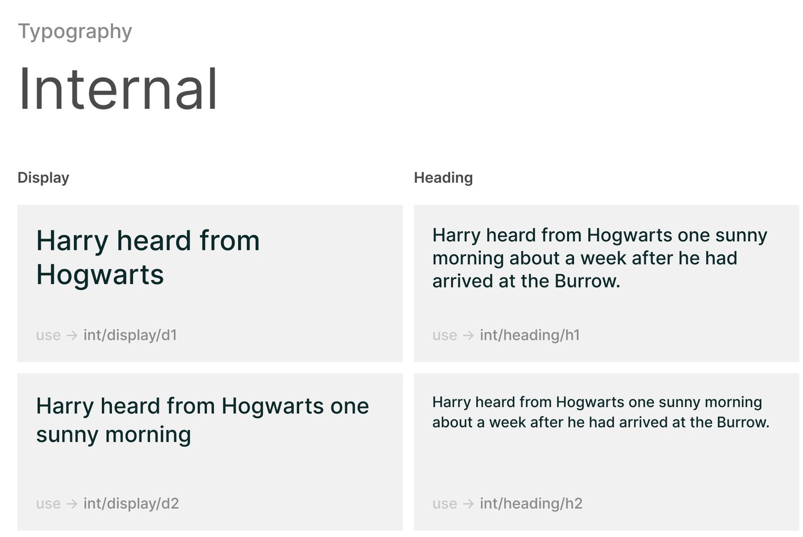
06 Foundations
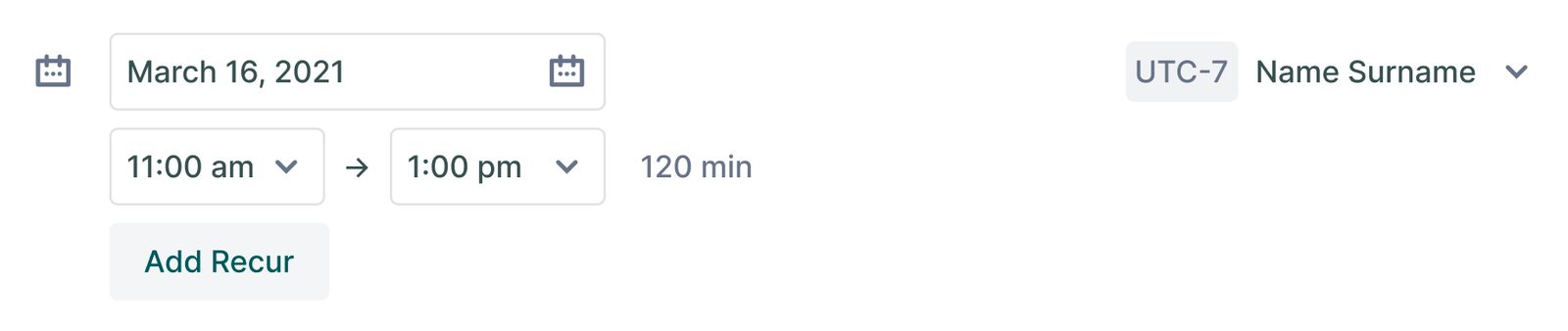
07 Components
In Elemy UI Library there are 14 unique components with more than 800 variants combined.
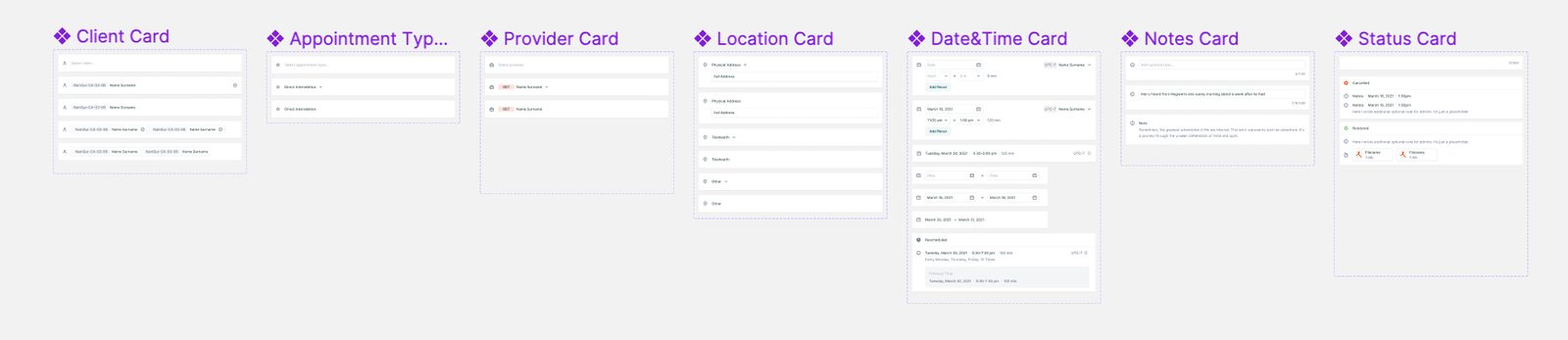
08 Structures
Outcome
The UI Library was successfully delivered and became a single source of truth in the design for the entire team.